Map-Making and Island-Building
Nomi Everall, Design & Technical Director
My first involvement with Storming Utopia was when I was approached as an illustrator (more so than as a Designer for theatre) to create a map for the first stage of the project. The Directors knew they wanted to tell a three-stranded story that had, at its heart, three types of storm: a domestic ‘storm-in-a-teacup’ tale of tempestuous family relationships, one individual’s story of struggle with a mental-health Lear-like tempest of the mind (a ‘brainstorm’), and a much wider story of environmental or ecological tumult (based in part on the ongoing issues in Oxford around flooding in the Osney Island area). Ambitious in its aspiration to use these three storms to explore questions around the idea of Utopia and what makes a “perfect” world, the intention was that at the resolution of the story – whatever that might be – a large piece of artwork would be revealed which would, in part, visually represent all these ideas. Part map, part visual storyboard of ideas, this artwork would have been created by one of the central characters: a young graffiti-artist struggling academically and inarticulate in the face of his own anxieties but capable of expressing both his feelings and his understanding of his world through an alternative, visual language.
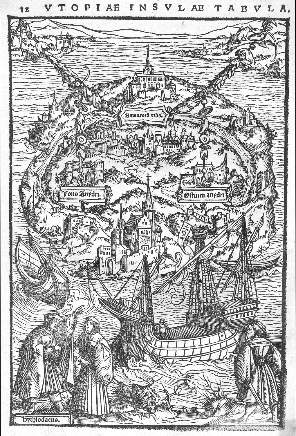
I was introduced to the illustrated maps of Sir Thomas More’s Utopia and was fascinated by how the images were clearly both recognisably island maps and images of human skulls. Using this idea and the simple black-and-white line-drawing style of the original images, I set about trying to create something which could conceivably have been created by a teenage graffiti-artist, encapsulated as many ideas of the play as possible and that, broken into three distinct sections, might represent the three ‘storms’.
So, when you look at my first design sketch below, you will see how the left-hand section contains ideas of family conflict/separation and community/home (in the form of Cowley – an area of Oxford we imagined the character to have come from), the central section foregrounds the fracturing and fissuring of the encompassing skull image and the right-hand section includes both a representation of Osney Island (where we sited the ecological storm) and images of tsunami-like waves, whirlpools and flooding. Through it runs the sort of symbol-based visual language we expect from maps and the whole can be seen as an image of Oxford itself as an island bordered by its ring-road, whilst the style itself is more suggestive of graffiti-art, book illustration or that art-form that sits somewhere between the two (and seems to belong to young story-tellers) – the comic strip.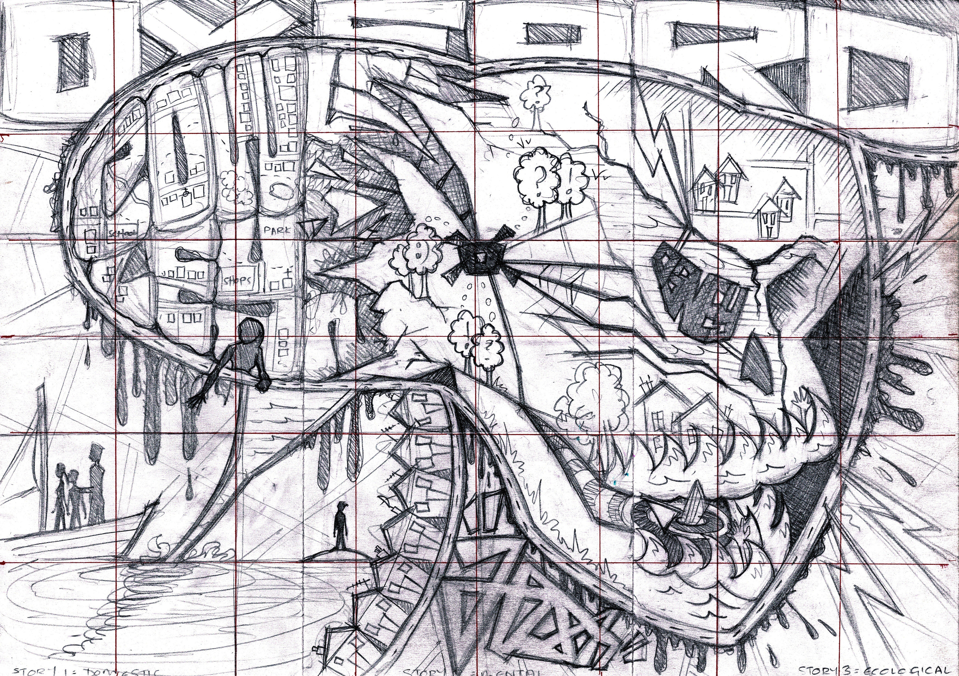
When we came to revisit Storming Utopia in 2017, we knew that on a practical level we had more resources to play with – fewer restraints on time and space, more materials and people to work with – and that that would give us the ability to develop a design for the play that could move beyond a few key props. We could build a world for our story. Or an island at the very least.
We also had the opportunity of working with the young design team at Pegasus Theatre. This group of 11-16-year olds were regularly attending weekly workshop sessions at the theatre, training in all the “behind-the-scenes” elements of theatre production, including set-design. We felt it would be an excellent opportunity (for both them and us) to collaborate on and have them collectively contribute to the final design of Storming Utopia. Working with them for five weeks on the design and five weeks on the realisation of the design (construction/painting etc.), I took them through a condensed process of what a professional Designer might expect to undertake – from research and theme exploration, through visualising & sketching worlds and transforming those worlds into usable, practical, buildable structural plans, to the making-processes of bringing it all to 3D, life-sized reality on the stage.
This second version aimed to expand, develop and refine the ideas of the first, and using William Shakespeare’s The Tempest (as well as More’s Utopia) was to become a particularly useful lens to focus on the modern parallel stories with. More than ever, islands seemed to be the place to start…
We, the Young Designers and I, thought about what islands look like; we talked about that cartoon image we all have in our heads of a desert island – a small pile of bright yellow sand with a lone palm tree topping it, heaped in an expanse of brilliant blue sea (with or without sharks) – and how something that essential and recognisable could be useful or limiting or both; we thought about how we could retain the essence of that idea (land-shore-sea/something, surrounded by an expanse of something else that seems uncrossable) without needing to literally recreate it. We talked about The Tempest and Treasure Island and Gulliver’s Travels (amongst many others). We talked about the significance of ‘treasure’ and islands as places where something you’re searching for or desire is kept safe or kept hidden. We thought about what islands felt like and how they could be prisons or sanctuaries. Or both at the same time. Or places which start out as one thing but transform into the other…
We thought about less literal islands – places of our own where we felt we could escape from the endless sea of reality to, to be outside the usual codes of behaviour or belief: our beds as places we could escape into the lawlessness of dreams from; dens or treehouses as sites of make-believe and fantasy worlds hidden within our domestic, mundane home lives; writing desks or reading-places as portals to imagined worlds of our own or someone else’s creation. We thought about books as islands – physically tiny things in the real world, containing expansive, alien, other-worlds we can escape into and through. We thought about ourselves – our bodies and our minds – as islands: each person a complex and unique whole bobbing about in the sea of our families and communities, in physical proximity to, but distinct from, a multitude of other people-islands. But also how families and communities could be islands and island paradises/prisons too…
And then we drew. We drew our own personal islands based on these ideas – trying to be visually clear about there being something, surrounded by something else, with a shore-line or border somewhere in between. Some of those islands were identifiable landscapes: our homes, our rooms, Oxford, our bodies; some were based on things that literally or figuratively take us out of our here-and-nows: books, a bathtub, language and the alphabet; some were a fusion of many of the ideas we’d been taking about.


Of course, we knew from the outset that we would not be practically realising eleven different set designs (one for each of the individual young designers in the group) and that it would be both democratically unfair and creatively limiting to just pick one the eleven designs. Quite against the utopian spirit of things. So, with that in mind, we began to think about finding a shared poetic visual language and put ourselves to the task of combining the ideas that worked best on both practical and imaginative levels.
We had been particularly taken by the idea of books as islands and I asked the group to develop their imagined islands into set designs that used the materials of books (books themselves, yes, but also paper, printed or handwritten/drawn texts, illustrations, maps, words and letters (of the alphabet)) as the building blocks. As an alternative, we all felt that water was significant, and we knew that the performers were using objects such as umbrellas in devising… We’d also all liked the phrase ‘a storm-in-a-teacup’ for its visual and figurative suggestions and so we thought it would be interesting to try to use a visual language based only around domestic objects connected to water: bathtubs and showers, buckets, umbrellas, cups and teapots, watering cans to name but a few. Each Designer picked one set of materials or the other and made 3D, scale model boxes of their developed island ideas.
There were islands which were giant books with pop-up illustrated objects and structures springing from them; there were worlds where every element was a 2D illustration each within its own 3D book; there were seas made from ink running from giant fountain-pen shaped land masses and seas made from giant letters that coalesced into text/ pages where they met the book-built land.


Of course, one of the greatest challenges for a set designer is creating one set – one visual landscape – that either encapsulates or transforms between each of the required locations of the play. During this process we also spent time thinking about how our staging could be used or changed to move us in place and time and we imagined ‘storms’ that put that process of transformation in front of the audience’s eyes.
Over in the rehearsal room, the performers were doing just the same. But their ideas were developing to include other themes that needed to affect the visual world too – Brexit and its impact was there, as were questions to do with immigration, asylum-seeking and modern-slavery. Political storms brewing in both the historical and modern ‘real’ world contexts being explored were coming to the fore in the form of debates between “This island’s mine…” and “No man is an island…” There were questions being raised about island-ownership and how/ why we create borders and boundaries (imaginary and literal). And about how and why we cross them too. There was a need, coming out of rehearsal now, not just to visually represent our ideas about islands and utopias, but also to draw attention to those other pressing questions in the form of doors, barriers, borders, boundaries, portals and miniature islands-within-islands that characters might cross or fail to cross the thresholds of.
From this huge wealth of ideas, along with the existing elements from stage-one, I then went away and produced a single design that tried to combine as many of the most poetic and most useful ideas as possible. Look closely at the annotations round the edges of the design illustration and at the Young Designers’ work and you will hopefully be able to see both how I wove together some of these visual ideas and how we hoped they would be interpreted by an audience looking at it.


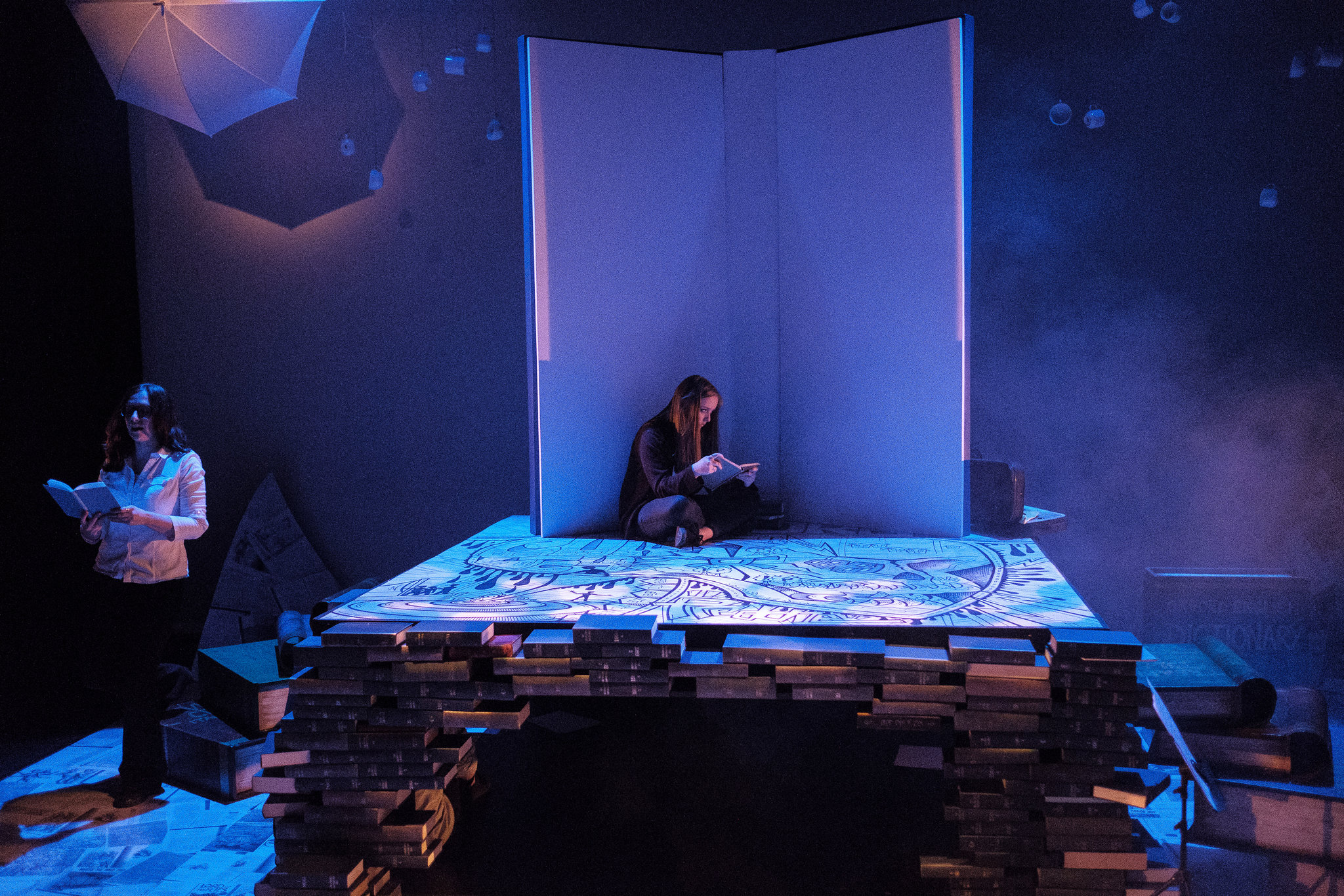
The map from Stage-One remained at the heart of the design, forming the island (central platform) floor as well as reappearing in its three-panel canvas form from stage-one. In its banner form it retained its role as an object of self-expression and protest (and was paralleled with Maya Angelou’s hopeful and defiant Still I Rise as it was revealed), whilst making it the island floor seemed to hint at the origin or the heart of the story coming from More’s Utopia and that first skull-map.


Around our book-built island a sea of pages from other texts which had informed and inspired the development of the design can be spotted, including More’s Utopia (and the maps and other supporting documents it contains), Shakespeare’s The Tempest and, my personal favourite island-utopia story, Maurice Sendak’s Where The Wild Things Are. This sea of words and stories seemed to me to beautifully capture the thought that language can be simultaneously both a means of accessing other ‘islands’ (people, places, cultures, stories) and a means of excluding people from the same.
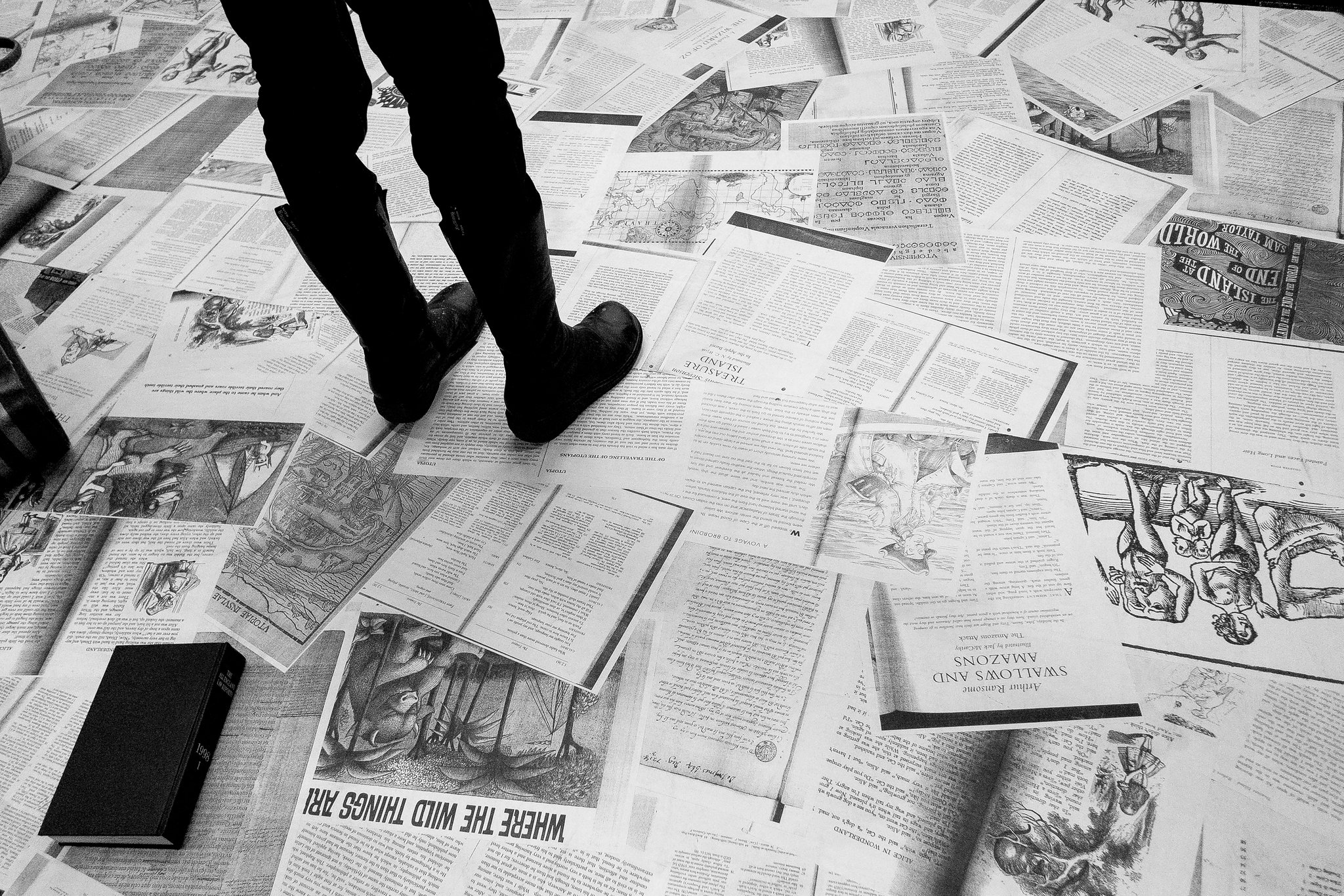
Having created a design, we then had to build it and you can see below some of the process photos from our construction phase. The giant books, making up an important part of our island landscape, were built and painted by the young designers and they specifically chose many of the titles they painted on those books as examples from literature that best reflected the ideas of islands and utopias they’d thought about. They included: The Tempest, Peter Pan, Tom Riddle’s Diary, The Oxford English Dictionary, Utopia, Treasure Island, Gulliver’s Travels, Invisible Cities, Alice in Wonderland, On Cannibals and Lord of the Flies.


Pegasus Young Designers
Hugo Cather, Rio Chase, Joseph Covey-Foster, Alice De Jongh, Celeste Dewshi, Rosalie Ehata, Heidi King, Finlay Lamb, Zak Mook, Tom, Jake Stephenson